Blog
/
Outliers in the Visualization of a Digital Collection – Real and Alleged Errors in Data
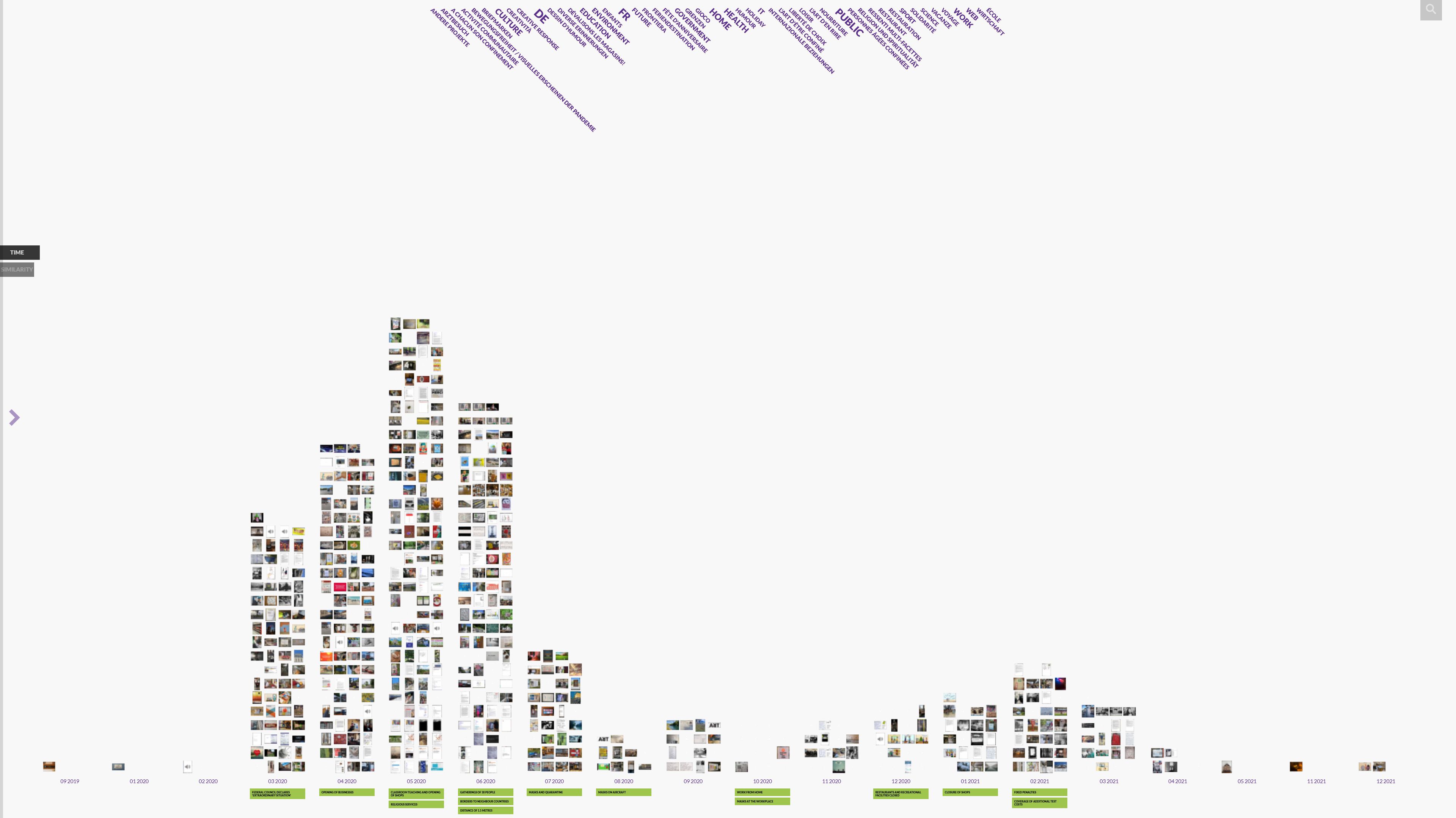
Data visualization with images and metadata offers a different insight into digital cultural collections than just using a search interface to access the records in the database. Visualizations make patterns and relationships visible that would not be perceived by simply looking through the records of some objects. VIKUS Viewer is a visualization software, open source available on GitHub, that was used to visualize the objects from corona-memory.ch. As a participatory archive, corona-memory.ch collects individual memories during the COVID-19 pandemic in Switzerland. Everyone is invited to upload personal texts, images, videos, or audios (fig. 1).
 fig. 1
The corona-memory.ch VIKUS Viewer is accessible via vikus.dh.unibe.ch (see header-image). When the data was first visualized, there were three outliers at the right end of the timeline (fig. 2) that indicated objects dating to November or December 2021, even though that date was still several months in the future. Users who upload an object to the corona-memory.ch archive can add the date of the object themselves. Manual input is prone to mistakes, but has the advantage that even now, for example, a photograph that dates back to March 2020 can be added. For that reason, the automatically generated creation date of the record is only used to arrange those objects on the timeline for which the user has not entered a date or only the year. At the left end of the timeline, three more outliers can be detected. One object even has September 2019 as its date, when the COVID-19 pandemic did not exist at all. This time, however, the date is correct, as becomes clear when reading the object’s description text (fig. 3). It is a painting showing the microscopic view of viruses that someone bought in the pre-Corona period and a few months later unexpectedly became topical.
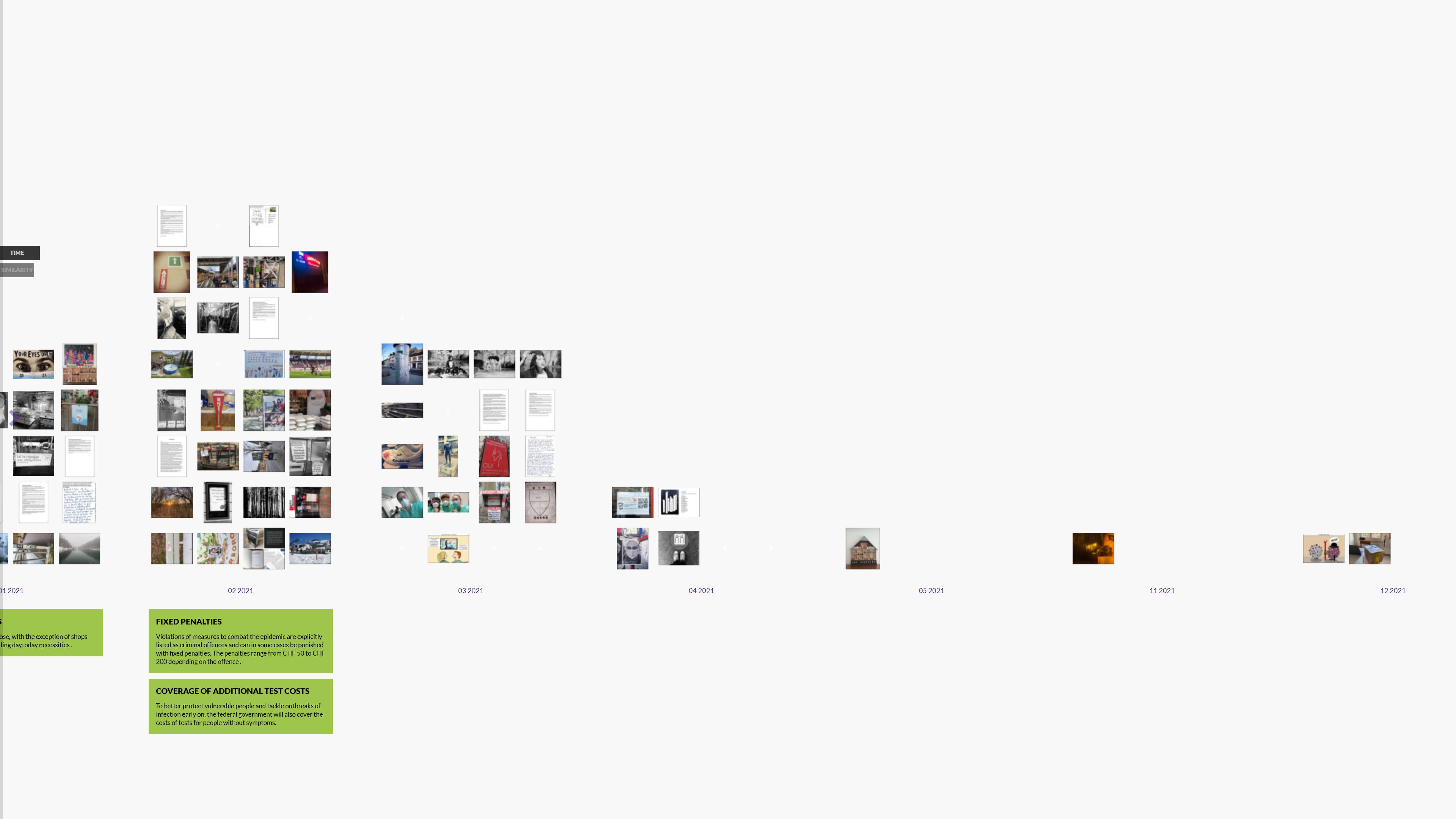 fig. 2
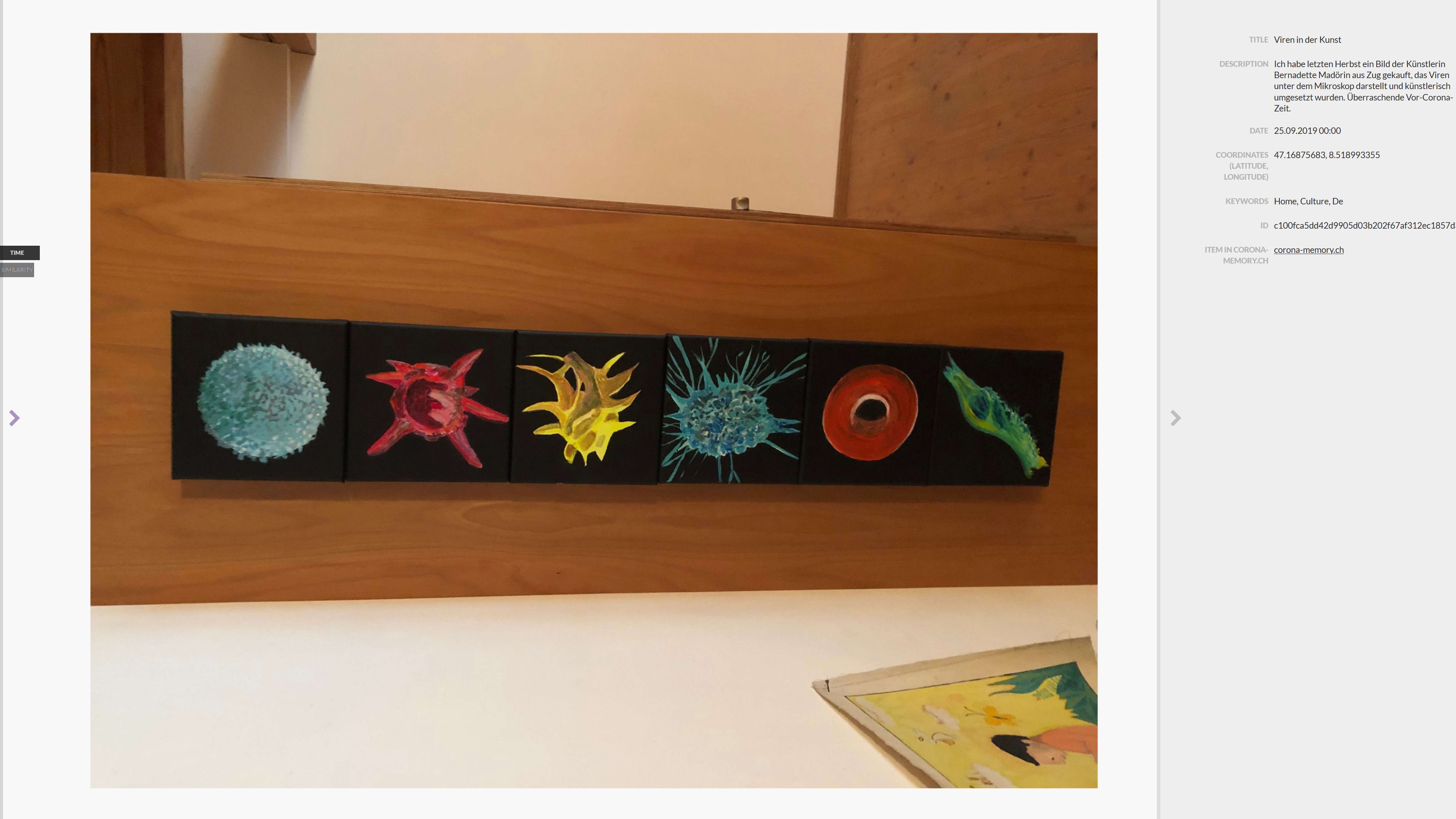 fig. 3
Irregularities in the data become immediately obvious in a visualization, respectively when the view is changed. This helps either to spot errors or to gain insights from the data. Visualization is a powerful approach to analyze digital collections and is further supported in the case of the VIKUS Viewer by switching from the timeline to the similarity view (fig. 4). The objects are rearranged based on the t-SNE algorithm. This view allows to identify clusters of images with similar content that would be difficult to detect when browsing the object catalog on corona-memory.ch.
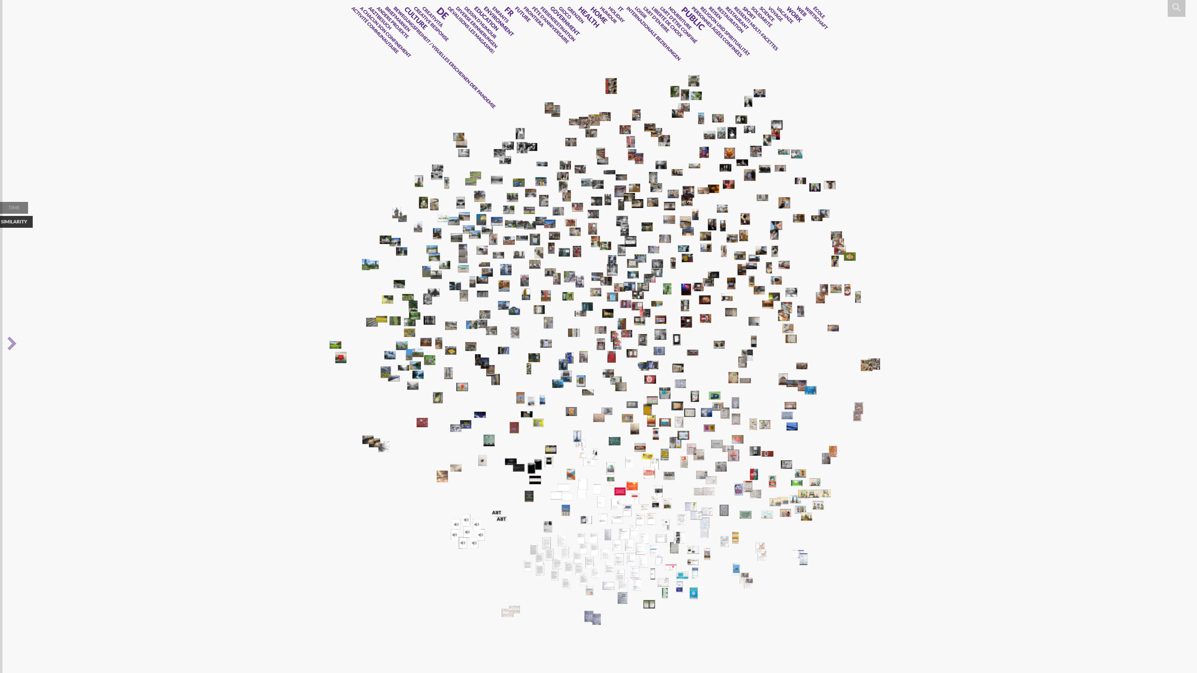 fig. 4